User-Based Comparison Report
The User Comparison Report enables a detailed, side-by-side comparison of multiple team members based on assessment results. It highlights individual strengths, gaps, and alignment across various performance areas—empowering teams to grow with insight-driven clarity. Beyond visual charts, the Question Analysis section provides a granular view of individual responses to every question, broken down by blocks and subblocks. This allows you to pinpoint exactly where team members agree or diverge—essential for fostering alignment, surfacing miscommunications, or initiating focused conversations.
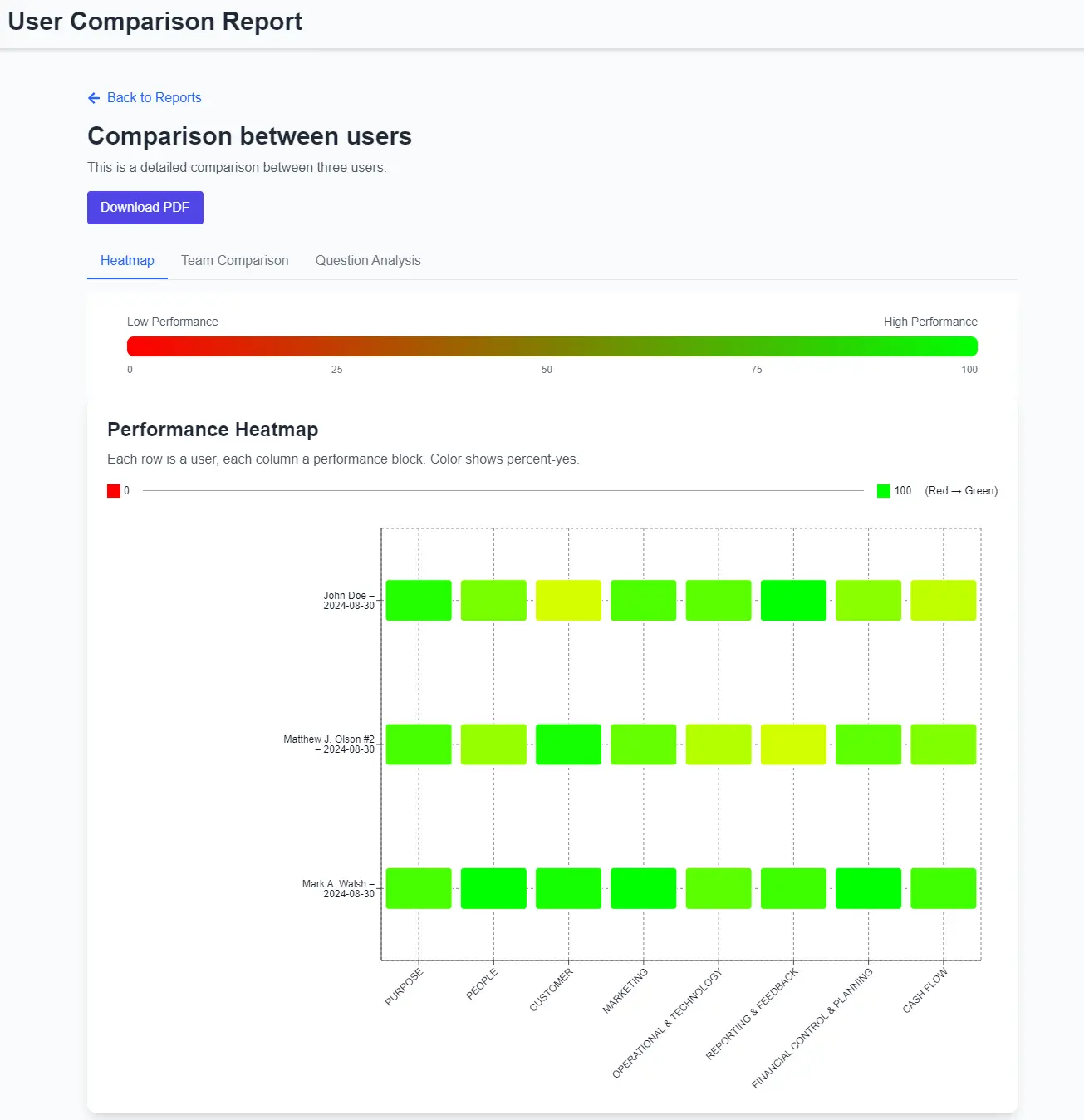
Performance Heatmap
The Performance Heatmap offers a fast and intuitive way to compare user performance across all business areas. Each user is represented by a row, and each assessment block by a column, color-coded from red to green. The more green, the better the score — making it easy to spot top performers, underperformers, and team-wide alignment at a glance.
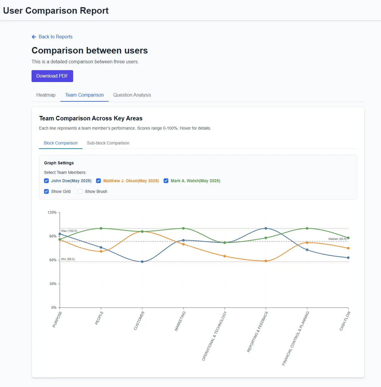
Team Comparison Graph
The Team Comparison Graph provides a detailed line chart showing how each user performs across assessment blocks. It helps visualize patterns, gaps, and differences between users. With toggles for sub-block comparison, brush tool, and multiple user filters, it's perfect for identifying strengths, weaknesses, and tracking alignment across roles or departments.